Marketing Design
kencko
Overview
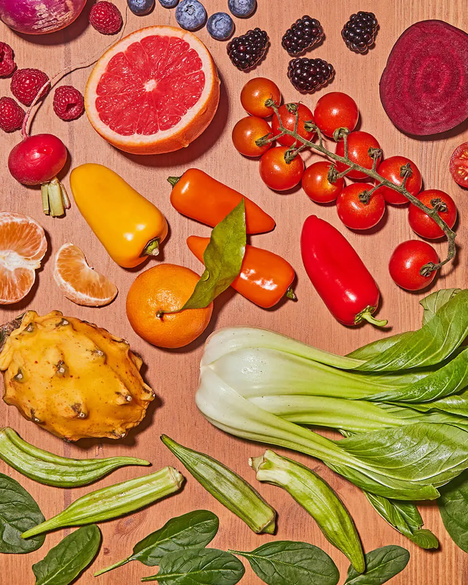
kencko is on a mission to help people eat more fruits and vegetables by offering nutritious, plant-based foods alongside education and support for healthier habits. By using freeze-drying technology, they reduce food waste and emissions while preserving nutrients. As a certified B Corporation®, kencko is dedicated to creating a more sustainable and inclusive future.
Category: Food & Beverage
My Role
At kencko, I own all marketing initiatives, including paid ads, email campaigns, social media, landing pages, and print collateral; driving retention, community engagement, and customer acquisition.

Email Marketing
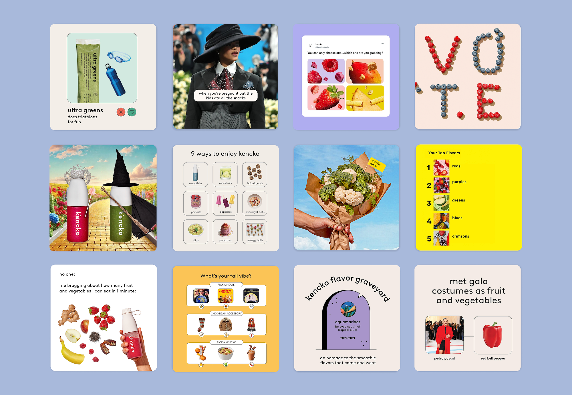
Social Media
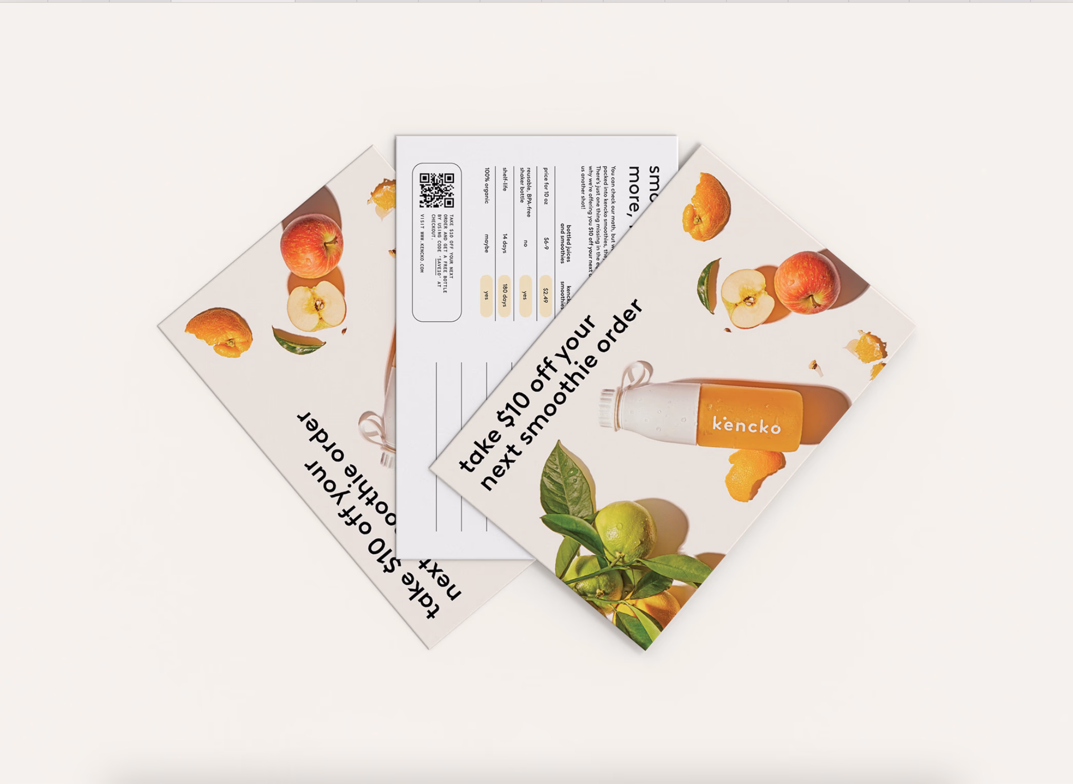
Direct Mail
Marketing Case Study

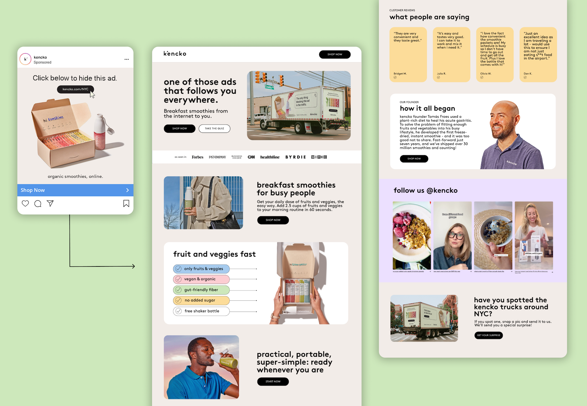
Just one of those ads that follows you everywhere 👀
Like most D2C brands, digital is our home medium. But we’re very aware of its limitations. Digital ads can be intrusive and annoying for the consumer, and they’re pretty formulaic, which makes it hard for brands to do something truly original. For our ‘IRL’ advertising debut, we wanted to make fun of ourselves, and maybe strike a chord with people’s experiences of the online ad world.
- Objective
- Develop a campaign that felt fresh and self-aware, building brand awareness while increasing smoothie sales. The campaign needed to feel cohesive across physical and digital touchpoints and bring in new customers without taking ourselves too seriously.
- Campaign Components
We created a full-funnel experience that included:- Out-of-home truck ads in New York City
- A paid social campaign
- A custom landing page
- My role
- Design direct response ads & landing page
- Design direct response ads & landing page
- Process
- Worked with the growth team to set campaign goals
- Partnered with the brand team on voice, messaging, and design
- Developed and QA’d the landing page alongside the tech team
- Coordinated with the social and PR teams for rollout
- Design Decisions
- Content design was informed by successful paid creative and results from previous A/B tests.
- Use of beige backgrounds to make our product pop on the trucks and landing page
- Results
The campaign resonated with audiences and boosted brand visibility. The mix of humor, relatability, and consistency across channels helped drive real engagement, and of course, sold more smoothies.
Email Case Studies
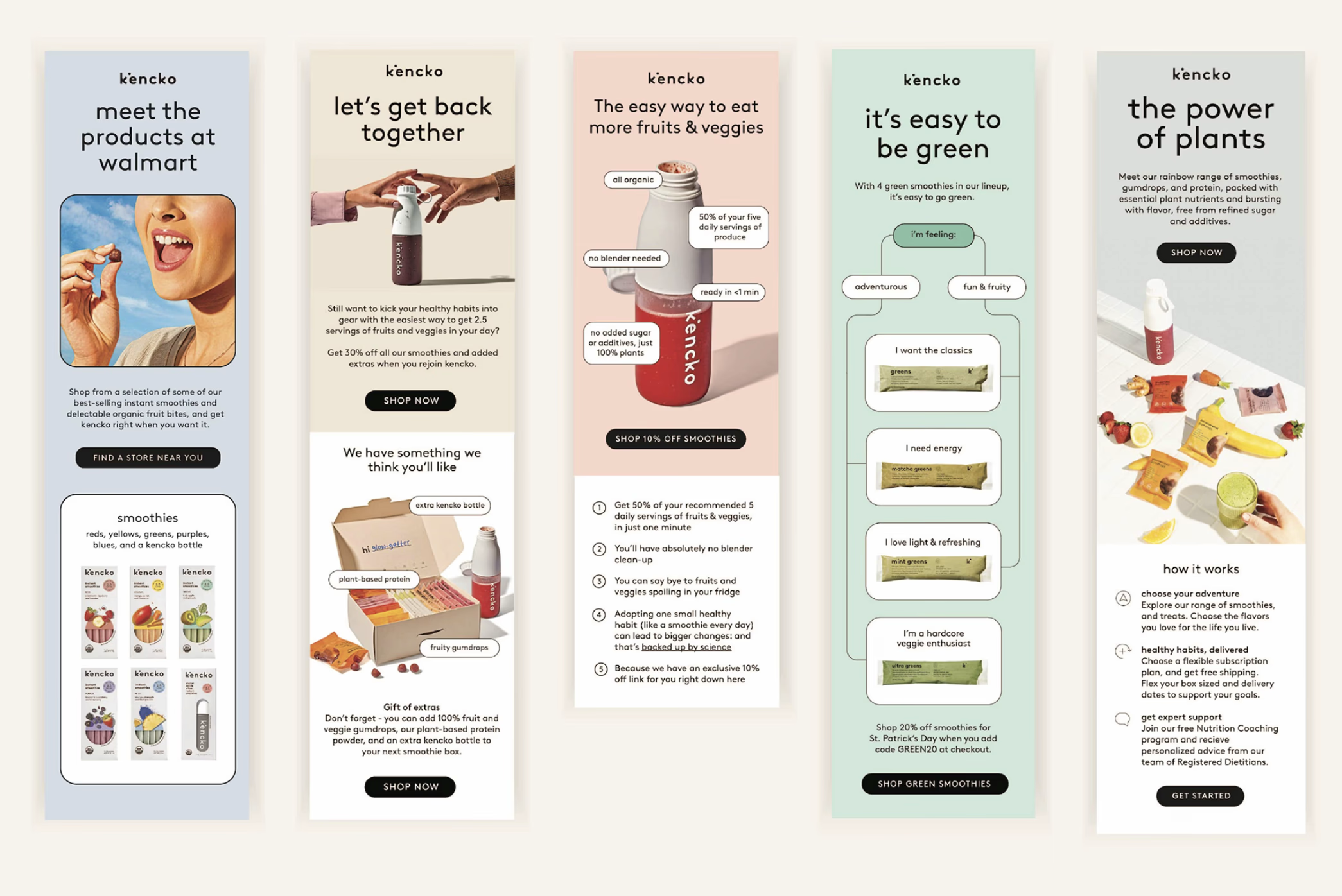
Nurture Flow
Once a lead filled out a form, they received a four-part nurture email sequence over 7 days. Each email focused on highlighting key benefits, increasing product understanding, and driving conversions.
- Objective
- Design a clean, user-focused email flow to convert leads into first-time customers for kencko.
- My role
- Email design and content strategy.
- Process
- Collaborated with the Growth team to define goals for the nurture flow and plan A/B tests. Partnered with copywriters to shape the content. Once each email’s structure was finalized, I moved into design, focusing on clarity, brand consistency, and performance.
- Design Decisions
- Mobile-first
- Balanced brand color palette with clear visual hierarchy
- Used icons, modules, and lifestyle photos to support key messages
- Prioritized easy navigation with clickable product categories
- Results
All emails performed above industry average benchmarks. Email #1 exceeded “excellent” standards with a 63.2% open rate and 13.6% click rate, showing strong visual and content alignment.
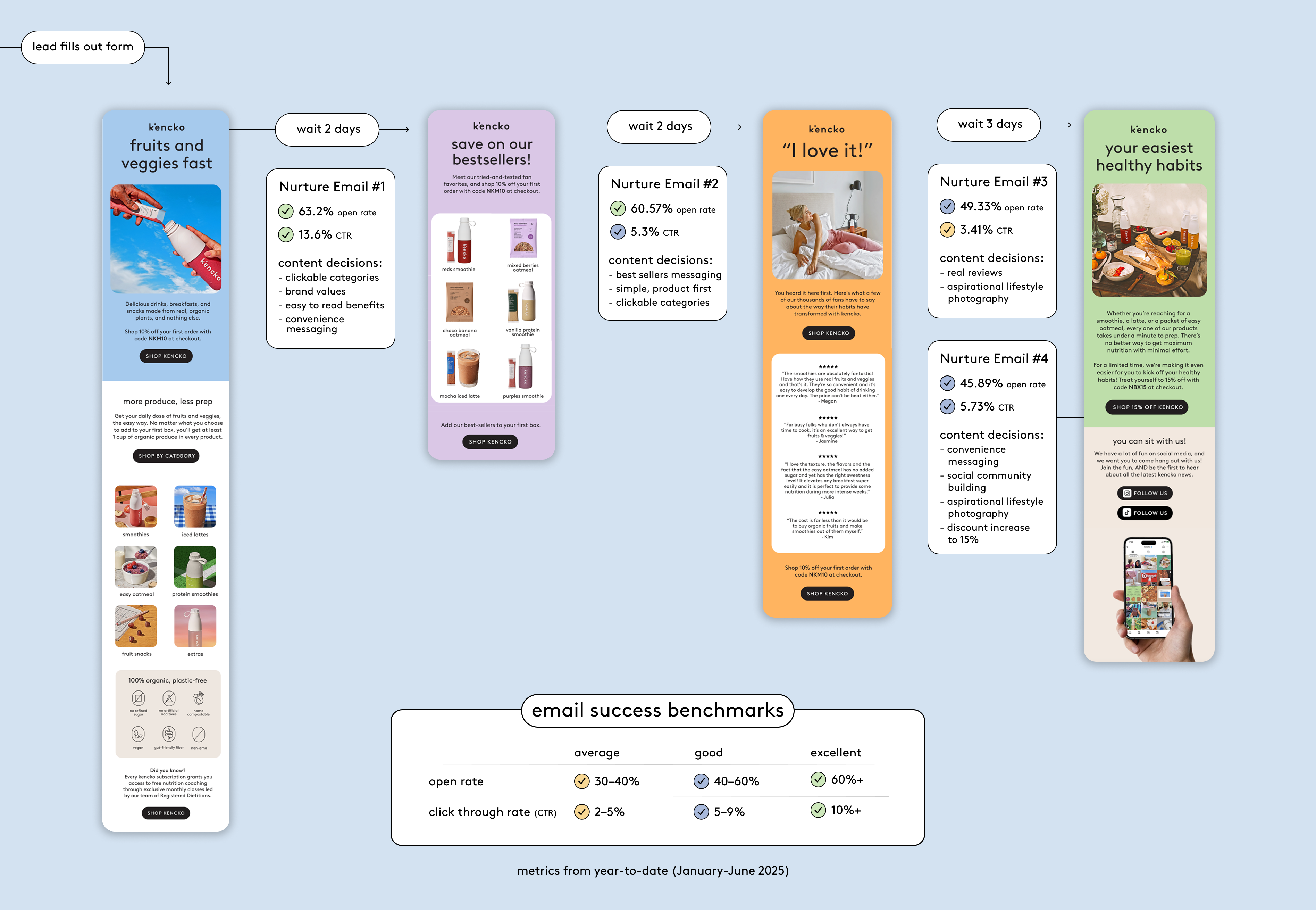
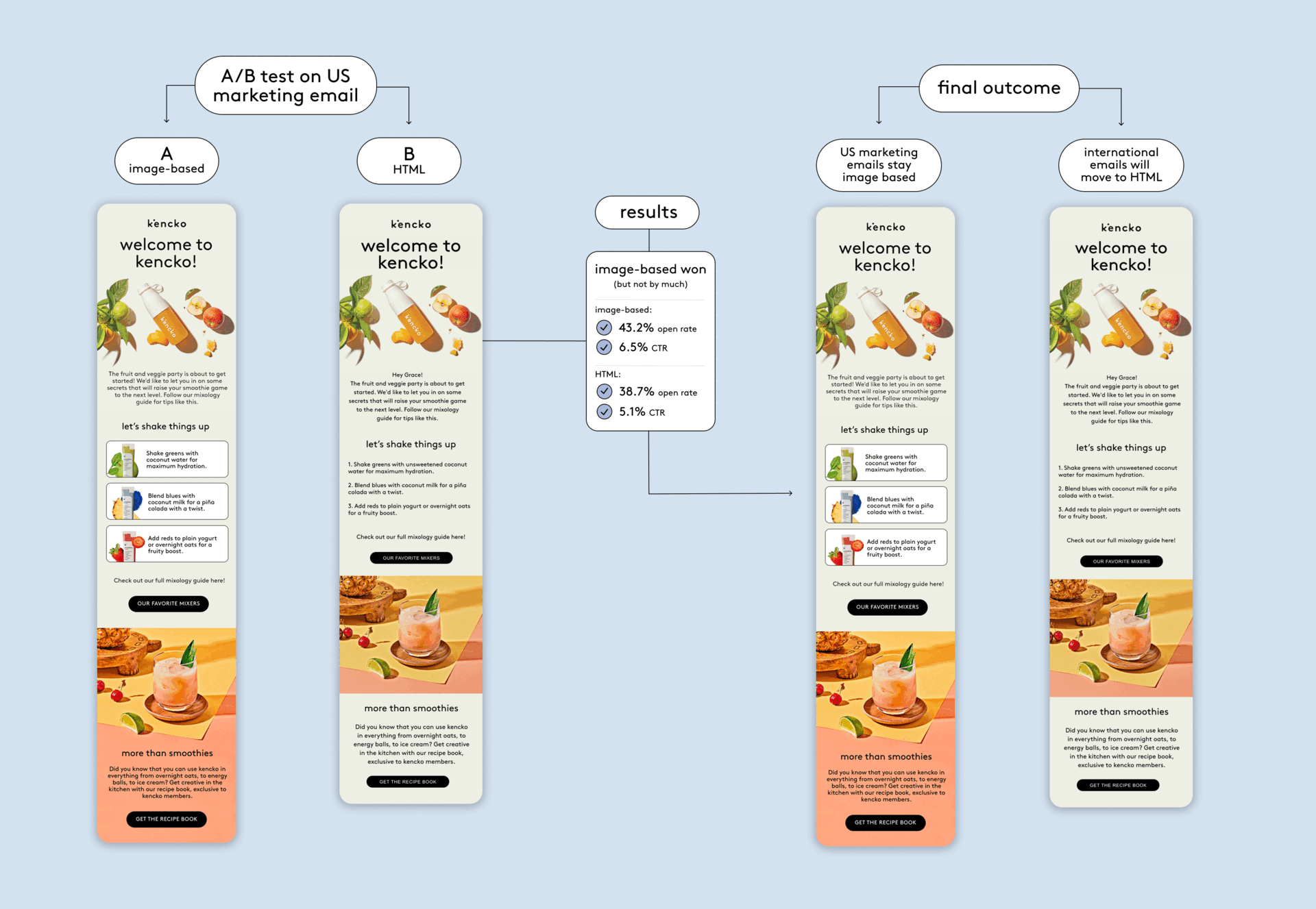
Image vs. HTML Emails for Scalable International Marketing
As our brand expanded into new international markets, we needed to adapt our marketing emails for different languages. The main challenge: balancing brand quality with scalable, editable templates. This project involved collaboration between the growth and brand teams to determine the best email format for future campaigns.
- Team Objectives:
- Growth: Make content scalable and easy to localize across languages
- Brand: Ensure all emails maintain a high level of visual quality and remain on-brand
- Process:
- We launched an A/B test using US marketing emails:
- Version A: Image-based emails with full design control
- Version B: HTML-based emails for easy content updates and dynamic personalization
- We evaluated:
- Performance metrics (click-through and conversion rates)
- Production time and effort
- Suitability for localization and future editing
- Pros and cons of image-based vs. HTML design
- We launched an A/B test using US marketing emails:
- Outcome (Everyone won!)
The image-based version outperformed in US conversion metrics and will remain the default for that market. For international campaigns, we chose HTML emails to support efficient localization, dynamic content, and long-term scalability.
Paid Ad Case Study
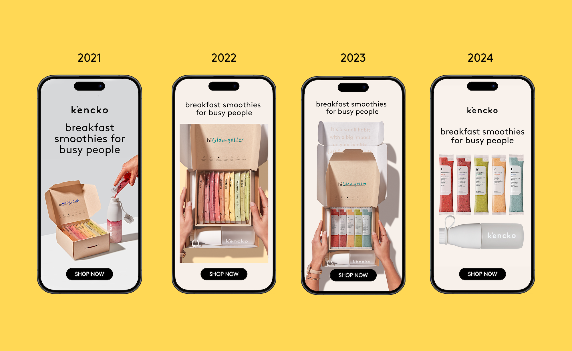
"breakfast smoothies for busy people"
Over the years, we've tested thousands of ads. But none have been able to convert more, with a lower CAC, than our "breakfast smoothies for busy people" campaign.
- Copyline
- The copyline really resonates with our audience who are moms and young professionals that don't have time to eat healthy in the morning. In these ads, we express that kencko is an easy and stress-free solution to their breakfast problems.
- Design
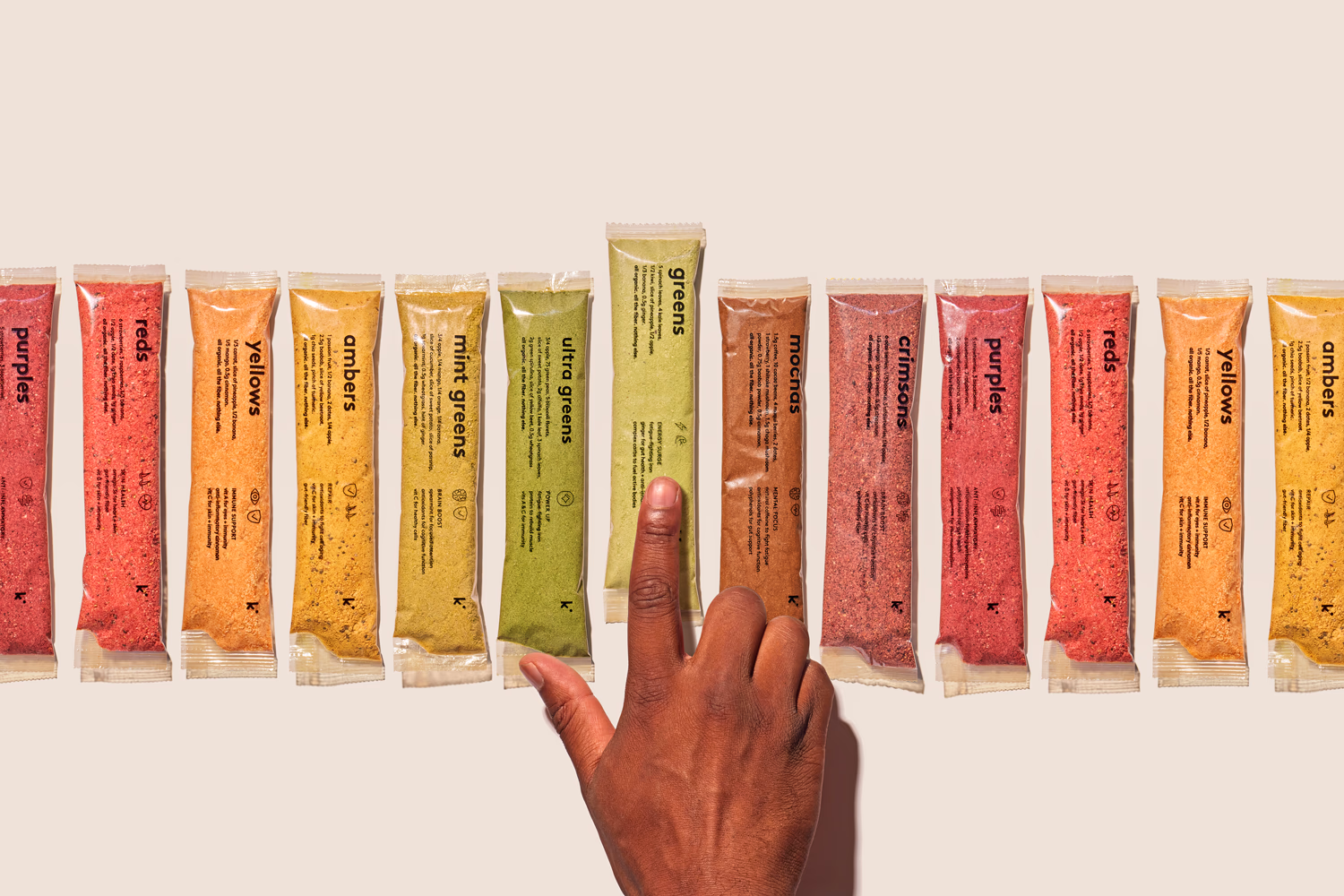
- kencko is all about eating the rainbow, so the use of color in our brand directly relates to our colorful products. Our audience loves to see the smoothies lined up, and for some reason, they love seeing them in a box. We've learned that using a neutral, light-colored background really helps the product pop. Over the years we've optimized the ads for our evolving packaging and our customer's preferences. Right now, they are telling us "simple is better."
More Ads We've Tested
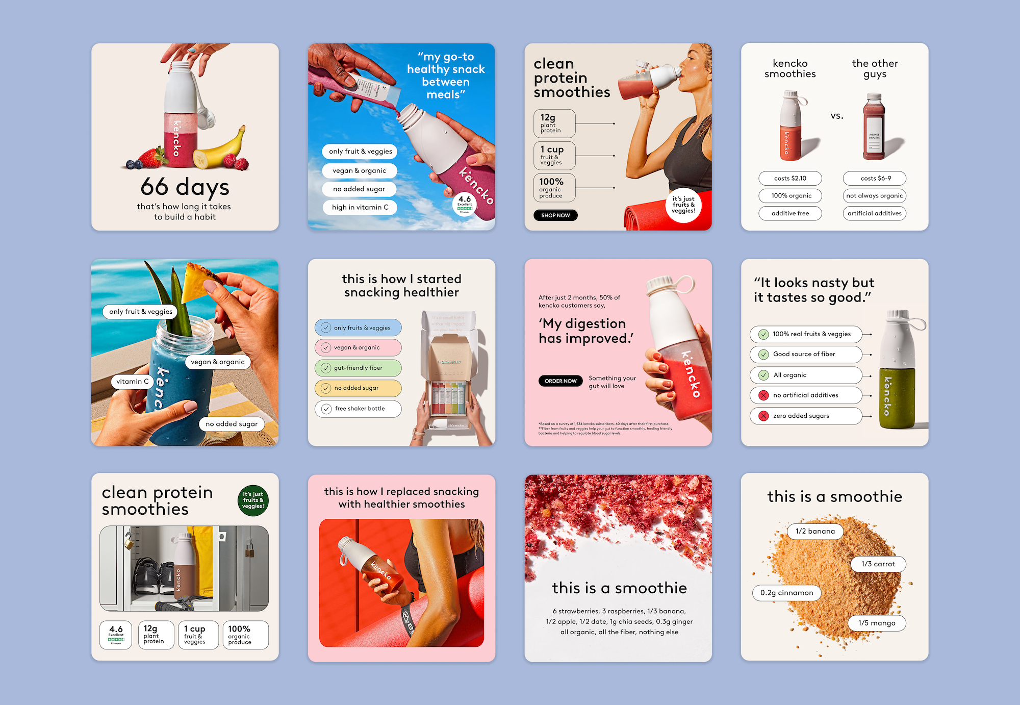
Selected projects
.jpeg)